A simple search for “Donation page best practices” brings up article after article of ideas to implement on your page. And honestly, most of them are based on gut feelings or “fundraising instinct” as opposed to real data and research.
As a result, every fundraiser seems to have their own ideal donation page layout or design – yet few are really based on proven strategies.
So we set out with RaiseDonors to truly take the pulse of what nonprofits are doing on their donation pages in order to try and win over donors.
And by comparing the donation pages of 203 organizations to strategies tested and proven through over 2,000 online fundraising experiments, we found some pretty fascinating insights that you’ll want to consider in your own online giving experience.
#1. Everyone Has Room to Improve Their Donation Page
Out of 203 donation pages, the median score was just 57%. Yes, that is out of 100. And if you remember from your school days…that’s a solid F.
The best scoring vertical was Human Services organizations. They had an average score of 63%. And interestingly enough, larger organizations didn’t really perform any better than smaller organizations.
We often say fundraisers are from Mars and donors are from Venus. We as fundraisers and marketers often look at giving from very different perspectives than our donors. We look at donation pages as a way to collect donations or to get more money. We tend to see it as just a processing tool, not a relational tool.
But donors give as a way to live out their values and make an impact.
And the challenge is that, intentionally or not, you carry your different views into the development and use of your donation pages. When you view a donation page as a transaction, it comes through in your design.
That’s why we need to see things through the donor’s perspective. The focus of our donation page should be on the difference donors can make.
Your donation page, just like your fundraising, is for them. Not for you.
#2. Nonprofits Aren’t Giving Donors a Great Reason to Give
Only 1 out of 3 organizations have a strong value proposition.
And 61% of organizations use less than 4 sentences of copy on their donation page. But our research and experience suggests that far more is needed to adequately communicate why a donor should give.
Organizations are relying too much on the donor’s internal motivation and their knowledge of the organization. And they’re assuming donors already know the impact their donation will have before they arrive on the website/donation page.
But chances are pretty slim that donors are 100% motivated to donate when they land on your page.
To make sure you’re giving your donors enough reasons to give, you should consider these four things: appeal, exclusivity, clarity, and credibility/believability.
- Appeal: How appealing is your mission to your donor? How appealing is the impact a donor will have through making a donation?
- Exclusivity: Are there other organizations doing this type of work? What makes yours unique? If you have an offer, can they get it anywhere else? (i.e. you can get a newsletter anywhere…)
- Clarity: Do they understand what you do, and what their donation will do?
- Credibility/Believability: Just because you say you’re doing good work doesn’t necessarily make someone believe you. Third-party testimonials, trustmarkers, and statistics build credibility so donors feel good giving you money.
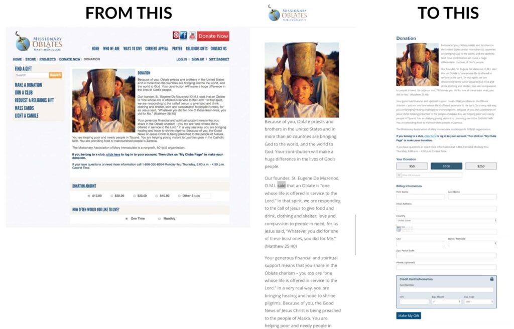
Tell donors why they should give. Make sure you’re clearly communicating the value of your organization’s work and the value a donor can have by partnering with you.
Here’s a good example from Defenders of Wildlife:

On this page, a donor can clearly see who they’re helping when they give.
It’s written for the donor and includes urgency. The headline reinforces who the donation will help. In the copy, it taps into a hero’s journey style where there’s an obstacle to overcome. It mentions how essential the organization’s work is, and how the donor specifically can help save endangered species with a donation.
The organization’s work is somewhat unique, and they also have some trustmarks on the donation page. This is a great example of how to have a strong value proposition on your pages.
#3. There is Too Much Friction in The Giving Process
We can improve the likelihood of a donation by removing friction. There are seven types of donation page friction.
- Field Number Friction
Donors are less likely to complete a task when you require more fields than necessary. 40% of nonprofits required non-essential information to process a gift. What can you make optional? Or provide some context as to why you need it.
- Field Layout Friction
Rearranging a form layout can make a big difference. A horizontal layout makes the form look shorter, and grouping information together makes it easier to fill out.
- Confusion/Distraction Friction
55% of donation pages have menus and navigation links to distract donors from giving. 38% of organizations used multiple calls to action on the donation page. Try removing any/all distracting links and conflicting calls to action.
- Decision Friction
Adding additional and unexpected decisions into the donation process like “Which fund would you like to designate your gift to?” can be frustrating and burdensome for donors. Worse, it decreases the chances of giving. Try reducing the decisions donors need to make.
- Error/Form Friction
Show donors a missed field or error before they get to the bottom and try to donate. It’s very frustrating to complete a form, click to move forward, and then receive an error you have to go back and correct. It’s even worse when it means entering all the information again.
- Device Friction
6% of nonprofit organizations’ donation pages weren’t optimized for mobile. Optimizing for mobile looks like streamlining the page, removing distractions, focusing on vertical fields, and pre-selecting donations. Just make sure you don’t cut out any value proposition text! Giving people a quick mobile experience means limiting some information, but explaining the reason to give is essential.
- Registration/Steps Friction
The more steps you have in the giving process, the more friction you’re adding. 30% of nonprofits required 3 or more steps to complete a donation. Try limiting the number of steps in the donation process and remove any verification pages.
These are all contributing factors to donors abandoning their gift. Your donation page is about communicating value. Limit the friction and confusion so the donor can continue completing their donation.
#4. Recurring Giving Remains a Big Opportunity
Nearly 3 out of 4 nonprofits didn’t communicate why someone should give a recurring gift during the one-time donation process.
Some other notable recurring giving facts:
- 11% of organizations defaulted to a recurring gift.
- 14% used a pop-up to suggest a monthly donation.
- 6% attempted to immediately upgrade one-time donors to recurring.
By and large, nonprofits were hoping for recurring donors more than actively trying to suggest or recruit recurring donors.
Recurring giving is a great way to move donors into a key multi-year donor because they give more in a year and in a lifetime. They’re more likely to be retained. We’re seeing more people become first-time recurring donors because subscription-based services are becoming more common.
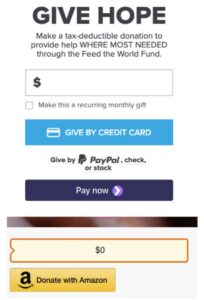
We found that 74% of organizations used a simple approach to communicate recurring giving in the one-time flow. It looked something like this.
We also found that only 7% of nonprofits had a value proposition for why you should become a recurring donor. Here are a few examples…
This organization on the left in the image below used an arrow to point to the recurring giving option. This a more subtle approach.
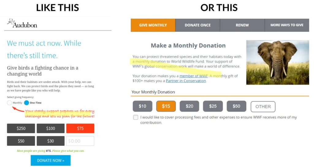
The organization on the right defaulted the monthly giving option on the donation form and talked specifically about the value of a monthly gift. They also used some anchoring with a $100 amount to become a partner, but they’re really pushing monthly giving. This is a more aggressive approach.
#5. Mobile Giving is Getting Better – But it Still Needs Work
Only 6% of nonprofits didn’t have a functional mobile giving experience, which is good. That means the vast majority of organizations were optimizing for mobile. We didn’t need to pinch, scroll, or zoom the page. There’s a big range between mobile-optimized pages and functional mobile pages, but the good news is that most organizations were at least functional on mobile.
The mobile version of a donation page resizes and rezooms so that you can scroll and complete the form easily. This should play a large part in how you design donation pages.
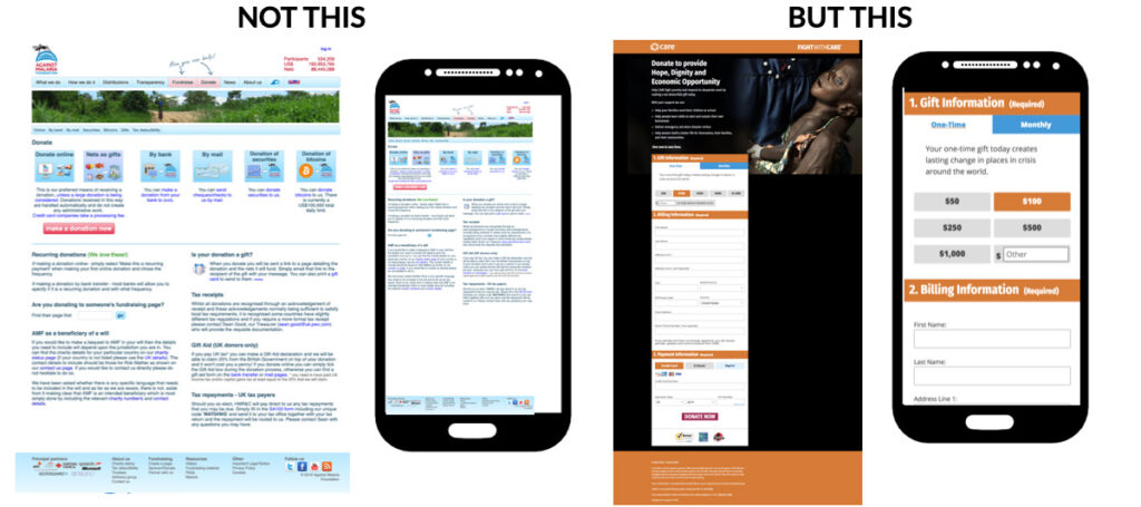
This experiment below shows just how important mobile optimization is. This original page went through a radical redesign of changing the donation template. There are lots of changes between the original and the treatment pages.
The biggest changes involved streamlining the page, removing distractions, and pre-selecting donations. When tested against each other, they found an 18% increase in donations, and the mobile version accounted for a 64% increase in donations on mobile devices.
Optimizing for mobile — specifically for pages and organizations that get a lot of mobile traffic — makes a big difference.
We noticed that 14% of organizations removed the reasons to give form their mobile donation page. Don’t do this.
The reasons to donate provide clarity, credibility, and impact in the donation process. Your donor needs to know and understand those things to trust their donation is going to make a difference.
Test your giving process on mobile and ensure your donor can still see the value proposition.
#6. Most Pages are Using the Same Gift Array Strategies
More than 8 in 10 nonprofits are using a gift array for donation selection compared to 17% who use an ‘open field’ or ‘choose your amount’ strategy. Nearly 2 out of 3 donation pages have 4 or 5 gift options, and 1 in 4 start with $50.
We’ve seen some interesting gift array tactics. These organizations used social proof to nudge donors to give more.
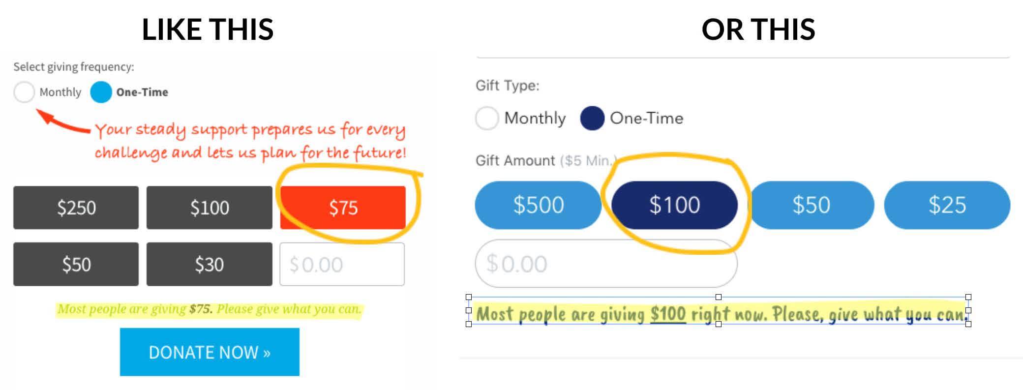
In each case, the preselected amount lines up with the copy that’s trying to leverage some kind of social proof. Below, you see an experiment where an organization tested this social proof concept on the gift array. They added “Most Popular” above the $50 amount and preselected it.
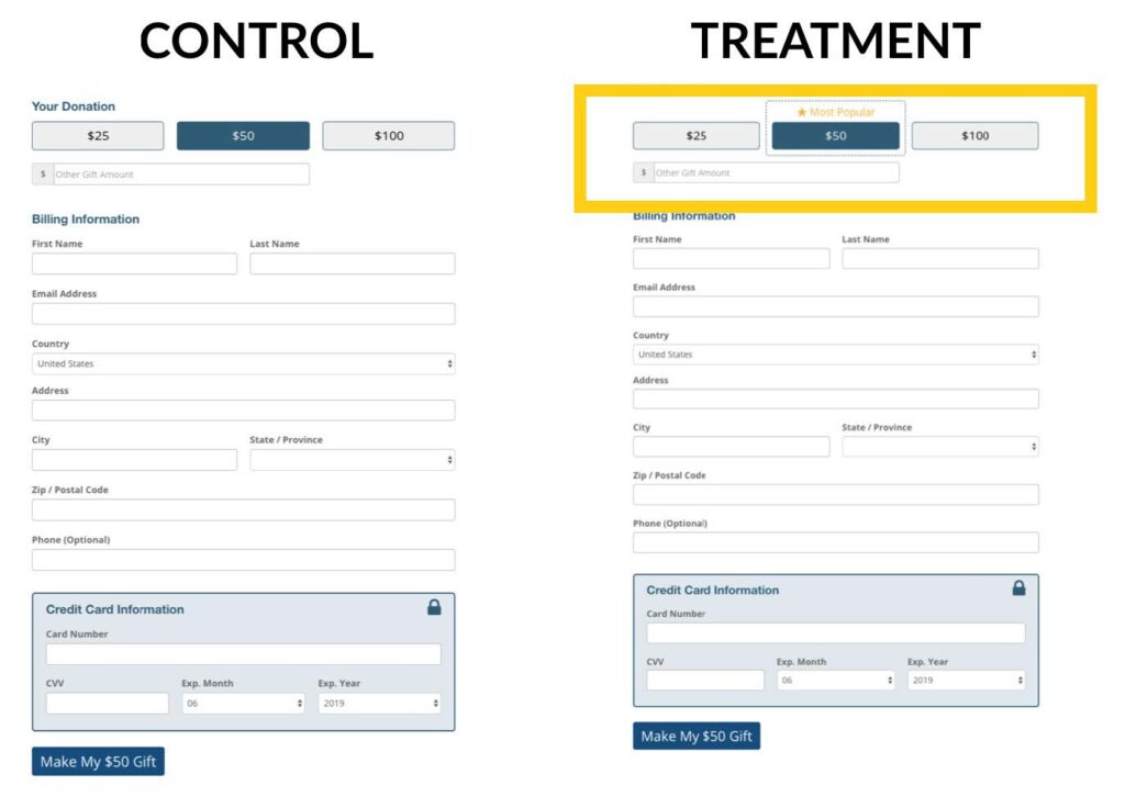
This led to an almost 15% increase in average gift. And they had an almost 24% increase in revenue. This is worth testing! Try adding in messaging or social proof to a preselected giving amount. Make sure it’s higher than your average gift.
But should everyone have a gift array? Well, maybe not. In this case, having no gift array actually increased donations by 126%.
Instead of a gift array, they used a minimum amount and people could enter their own number. A gift array could slow someone down and decrease generosity because they might initially want to give more than the pre-selected amount. And they might know exactly how much they want to give. Test whether an open field or a gift array works better on your pages.
An open field might be less effective for the non-donor or the new donor. Unless you have a really high average gift. Then a gift array can be more useful. It’s like a suggested tip when you’re in a foreign country. It helps the person know how much they should be giving.
#7. The Thank You Page is Underutilized in the Giving Experience
While almost every organization had a thank you/confirmation page and said thanks, only 46% did so in a way that continued the value proposition.
27% of nonprofits had nothing for donors to do after making a gift.
Just 12% were encouraging a 2nd gift — either one-time or recurring. And 36% of confirmation pages didn’t actually note the gift amount.
A thank you or confirmation page is an opportunity to say thank you and reiterate what just took place. You can tell your donor what to expect next from you or what their donation will do. You can reemphasize your organization’s mission here too. And then you can lead them to the next action.
Sometimes organizations do this in a very cold and transactional way, like this one.
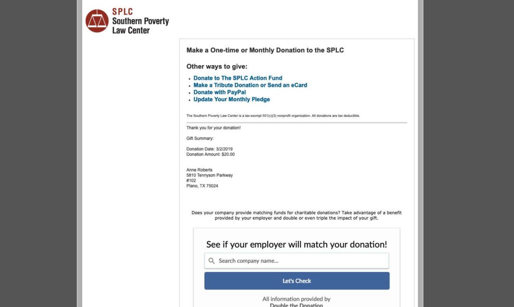
They ask for an employer match and added additional links before they even said thank you for the donation. The actual thank you is small and receipt-like. The thank you and donation details — from a design standpoint — feel unimportant and are not part of the conversation.
A good donation page should facilitate a good conversation. In comparison, this one reemphasizes their mission, and tells the donor what to expect next for tax purposes. They include more actions they can take now and ask for feedback on the giving experience.
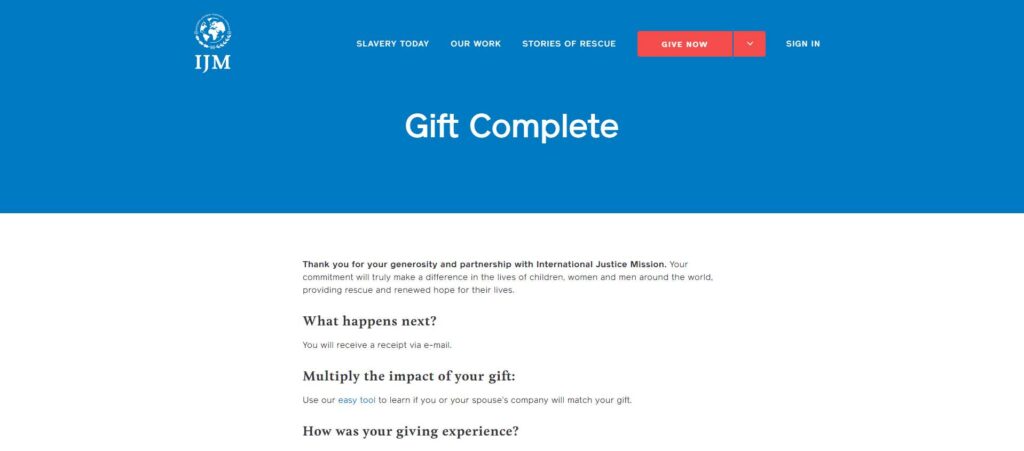
This is a much warmer and functional page. And the actions make sense in conversation, and in the context of the donor journey.
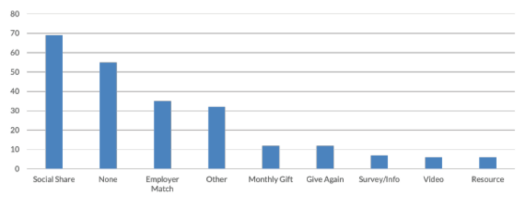
The most popular next step offered was a social share. And 55 organizations offered no next action at all. This is a huge opportunity.
Here’s a simple checklist to create a great thank you/confirmation page:
- Thank the donor
- Reinforce the impact of their gift
- In context — and after they’ve been thanked — suggest a next action that makes sense and relates to the donation they just made
Get The State of Nonprofit Donation Pages Report
These tips and ideas are just scratching the surface of all that’s included in the free report, The State of Nonprofit Donation Pages.
But if you take one lesson away from all this date, let it be this: your donation pages are mental conversations between you and your donor. Make sure that you aren’t treating your donation page as simply a transactional tool, but as another step in building a real relationship with your donor.