Removing friction from your nonprofit donation page is top priority as it improves the chances that you’ll raise another donor for your cause. Here’s another kind of friction that you should be on the lookout for as you optimize your pages.
As donors work their way through your content, there’s a moment when they know they want to give.
They’re experiencing an emotional climax.
They feel connected on many levels to your cause by now, and they trust in your value proposition.
Unfortunately, even at this powerful moment, the least amount of friction can convince a potential donor to walk away.
Friction is any kind of discomfort, doubt, or inconvenience that causes a donor to give up on giving a gift.
In this series on removing friction from nonprofit donation pages, we’re covering the seven types of friction we saw in our research for the State of Nonprofit Donation Pages Benchmark Study.
Today, we’re going to consider field layout friction and how optimizing the field layout on two different cases improved the conversion rates on these nonprofit donation pages.
Field Layout Friction
The layout of the fields on your giving page is more important than you’d think.
But we found that when the fields of a giving form were arranged in a dense or confusing manner, there was a negative impact on giving.
Case No. 1
For example, in this experiment, the form fields are the same but are laid out differently.
On the left side, you can see that we stacked the form fields vertically.
It’s a simple layout, right?
The only thing the donor has to do is keep going down filling out each field one by one.
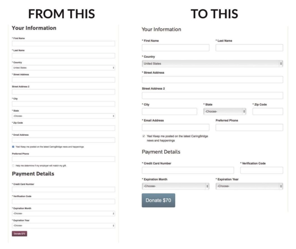
On the right, we changed the layout.
We took advantage of the horizontal space on the sides of the landing page to place an extra field or two on the side.
This makes the form look shorter, and you complete the information in groups.
What did this layout change do?
The change caused a 39% increase in donations!

That’s right. Simply changing the layout removed friction from the donation page that holding the nonprofit back from 39% more giving revenue.
But why?
First of all, the layout on the right makes the form feel shorter.
This makes you feel like it won’t take very long.
Visually long giving forms, even if they have the same number of fields, cause friction because you just feel like it’s going to take a while to get through.
Also, when you’re going down through the form fields, you can’t help but feel like there’s no end to them. It’s just one after another.
But when form fields lay next to each other, you can see the end of the giving form easily.
And when you see the light at the end of the tunnel, you feel better about getting there.
Case No. 2
Here’s an example from the research study where every form field is on a separate line, and they’re not taking advantage of any horizontal space.
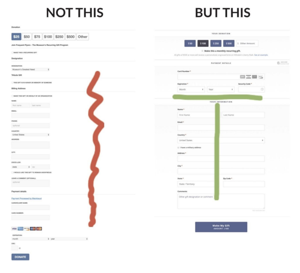
Now compare the left one to the example on the right.
Can you feel the difference?
The first page wastes a lot of space on the sides. It’s narrow and cramped.
Most importantly, it looks much longer. Visually, it looks like a challenge.
Like climbing a mountain, the field layout on the left just doesn’t look like something the donor wants to do.
This is friction, and it will cause many potential donors to just walk away from the giving process.
Now consider the example on the right. The more horizontal form has a leaner flow and feels easier to complete.
It welcomes you to complete the form as it feels like it will be easier and faster to complete.
Donors can feel the difference.
But what about mobile layouts?
Good question.
Mobile layouts automatically restrict the amount of horizontal space available. You have no choice but to use the vertical form field layout on mobile.
It’s common for up to half of potential donors to visit your donation page on a mobile device.
For that reason alone, you must optimize all of your donation pages for both desktop, laptop, and mobile screen sizes.
As we saw in the two cases above, using the same vertical field layout that’s good for mobile on larger screen sizes, which have much more horizontal space, will scare donors away.
The solution is to design your donation pages for wider screens while using a mobile-responsive platform like RaiseDonors.
This way, you optimize the donation page once (for the wider screen), and then RaiseDonors takes care of your mobile layout automatically.
Thus, removing friction from your donation page for both desktop and mobile users.
But you know the best part of a mobile-responsive donation page?
It also removes friction for you too!

As a nonprofit leader or fundraiser, your work is extremely important.
The more we can do to remove friction from your job by eliminating tasks RaiseDonors can do for you means that you’ll have more time, energy, and excitement to do the things that only you do.
Like change the world.
So if you’re ready to see how RaiseDonors can remove the friction on your donation pages for both you and your donors, please contact us today!