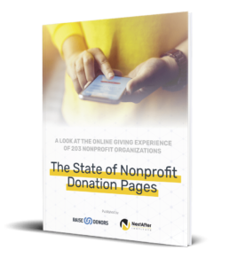
When you give this much online, you learn a lot about what makes a donation page work, and what doesn’t. Here’s what we found by giving to 203 organizations.
First of all, it’s not a typo – we did in fact give a gift to 203 organizations!
From February 27 through March 4, 2019, we gave $20 to 203 individual nonprofits In collaboration with our friends at NextAfter.
We went to the homepage of each nonprofit, found the easiest way to their donation page, and made a gift on a laptop or desktop computer.
With each one, we captured screenshots of the various pages we went through to give the gift.
If you want to see the whole report with detailed analysis of what we learned—including the screenshots—you can get the report for free.
Today, we’ll share seven high level insights we found in our study.
But you should definitely get the report! There’s no way I can fit everything here in a blog post.
1. Everyone has room to improve their donation page.
Most organizations feel “okay” about their donation page.
Unfortunately, this means that most people are not thinking about—let alone investing in—ways to improve their giving experience.
But as online giving becomes a larger and larger share of revenue, the cost of leaving so many potential donors out in the cold only increases.
There are only three ways to increase your online revenue:
- Get more visitors (traffic)
- Get more visitors to say yes (conversion rate)
- Get those who say yes to say “heck yes” (average gift)
Your donation page is the online tool that you use to improve the last two on this list.
Improving your donation page is all about exploiting its latent potential. You don’t know how many more donors you can raise until you try to make improvements!
Our study shows there’s a lot of potential that needs exploiting.
According to the results of our study with NextAfter, the median donation page score in this study was just 57% (grading scale of 0 to 100%,).
The best scoring vertical, Human Services, had an average score of 63% (in total, we gave to nonprofits in 12 separate verticals). The best scoring organization size grouping, $50 Million to $100 Million and $500 Million and up, had an average score of 57%.
And finally, 56% of the nonprofits in the study scored 60% or lower.
In other words, just over half of the 203 nonprofits in our study had major room for improvement.
You don’t have to leave donors and their gifts in the cold. Make efforts to improve your donation page and see how you can raise more donors for your cause.
2. Nonprofits aren’t giving donors a great reason to give on their donation page.
Your value proposition is your secret weapon—and too few nonprofits have one on their donation page.
A value proposition is your concise, solid argument for why someone should give to you rather than to another organization.
In our study, we found that just 1 out of 3 organizations have a strong value proposition.
The main reason this happens is because 61% of organizations used less than 4 sentences of copy on their donation page. Four sentences just isn’t enough to convince a donor to give.
Without a value proposition, you’re basically assuming that donors will give to you simply because they already want to.
For past and loyal donors, this assumption might be true. But for many donors—especially new donors—this simply isn’t the case.
3. Generally speaking, there is too much friction for donors to deal with when making a donation.
Friction is the opposing force that causes things to stop. When I put on my brakes, it’s friction the stops my vehicle from going through the red light.
On your donation page, “friction” is anything that stops or slows down the donation process.
Here are just a few of the sources of friction we found over and over again on the donation pages of the organizations in our study:
- 40% of nonprofits required non-essential information to process a gift
- 55% had distracting links on their page
- 30% had 3 or more steps to complete a donation
All of these issues can cause donors to hesitate or even stop giving their gift.
This is why removing friction from your donation page is so important.
4. Online recurring giving remains a big opportunity for nonprofits to improve and optimize.
Cultivating a first time gift is hard work, and it takes an investment into your marketing and fundraising budget.
First time gifts don’t always pay for the investment you make to bring in new donors.
But recurring giving makes it all worth it.
By committing to a recurring gift, donors multiply their impact on the world and increase their lifetime value to your nonprofit.
Unfortunately, almost 3 out of 4 nonprofits didn’t communicate anything around why someone should make a recurring gift during the one-time donation flow.
In general, nonprofits were hoping for recurring donors more than actively trying to suggest or recruit recurring donors.
5. The mobile giving experience is improving, but can still be optimized and further improved.
Having a mobile-ready donation page is critical, as a good percentage of visitors will be consuming your content and giving on their mobile device.
So when we saw that 82% of nonprofits have a functional mobile giving experience, we were happy.
But… 14% removed the reason to give—the value proposition—from their mobile giving page.
The value proposition is way too important to let go on your donation page.
You can improve your conversions by keeping your value proposition up front and center on desktop as well as mobile platforms. (This is baked into every RaiseDonors donation page.)
6. Many donation selection and gift array strategies are quite similar.
It seems like most nonprofits include a gift array on their donation page.
Our study showed more than 80% of nonprofits list out suggested donation amounts. Only 17% had donors set their giving amount without making suggestions.
How many giving suggestions did they include?
Almost 2 out of 3 of them have 4 or 5 options, and 1 in 4 start with $50.
7. The thank you/confirmation page remains an underutilized asset in the donor journey and online giving experience.
Like recurring giving, the thank you/confirmation page is an untapped resource.
Pretty much every organization presented a thank you/confirmation page after we gave our gift, but less than half of them said “thank you” in a way that reinforced the value proposition.
Right after the gift is when you want to reinforce the idea that your donor has done the best thing they could have done.
This is when you want to ramp up that feeling of joy and satisfaction that your donor gets when they give.
That feeling of goodness is the primary thing you have to offer your donor in exchange for their gift.
Also, including reasons why they should consider becoming a recurring donor is also a great idea for your thank you/confirmation page.
Need help optimizing your donation page?
If you need a helping hand improving your conversions on your donation page, we’d be glad to help. RaiseDonors makes it ultra easy for organizations of all sizes to build, launch, and measure the impact of your online campaigns.
Contact us today—and see how we can help you raise more donors.


